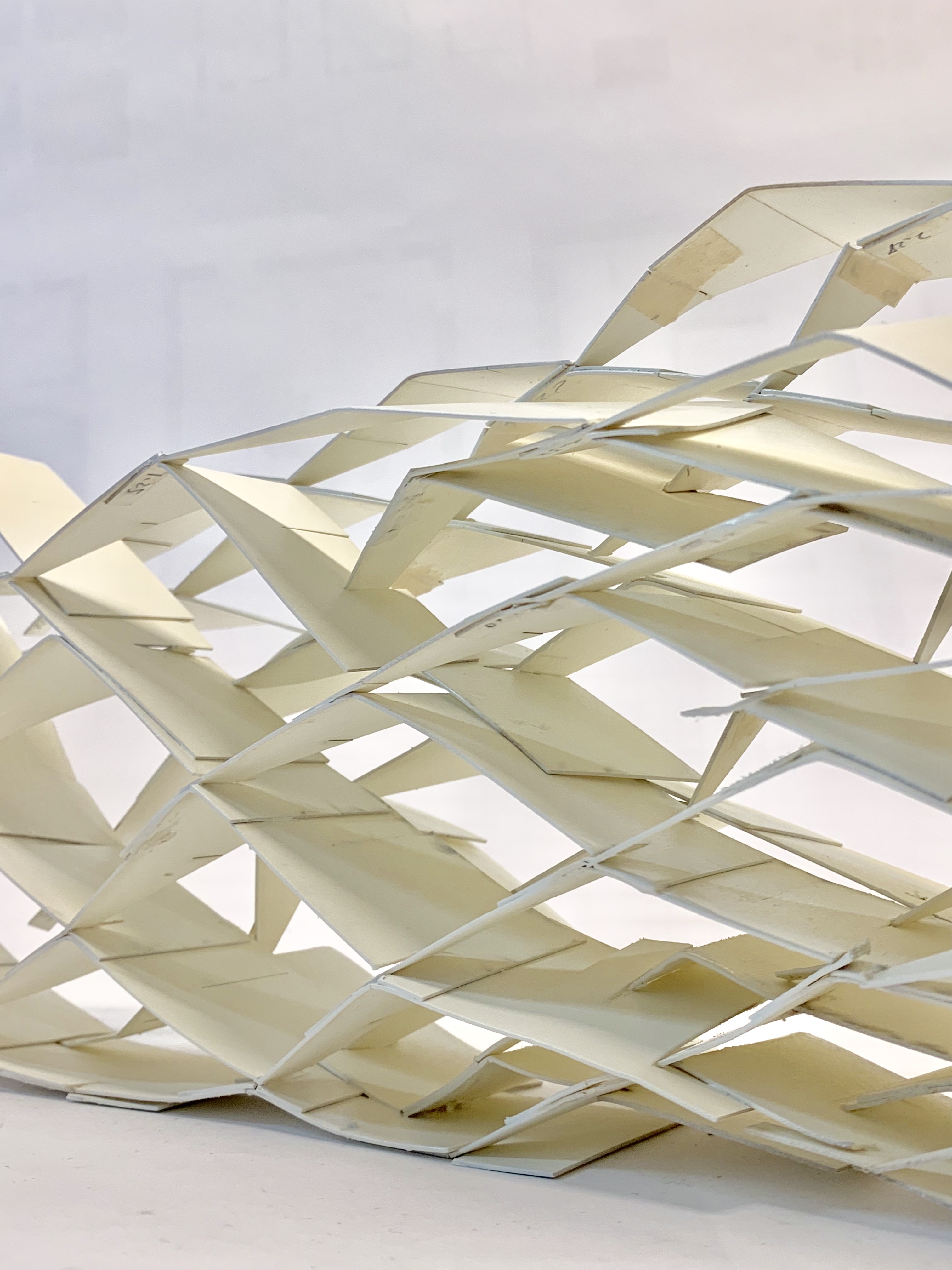
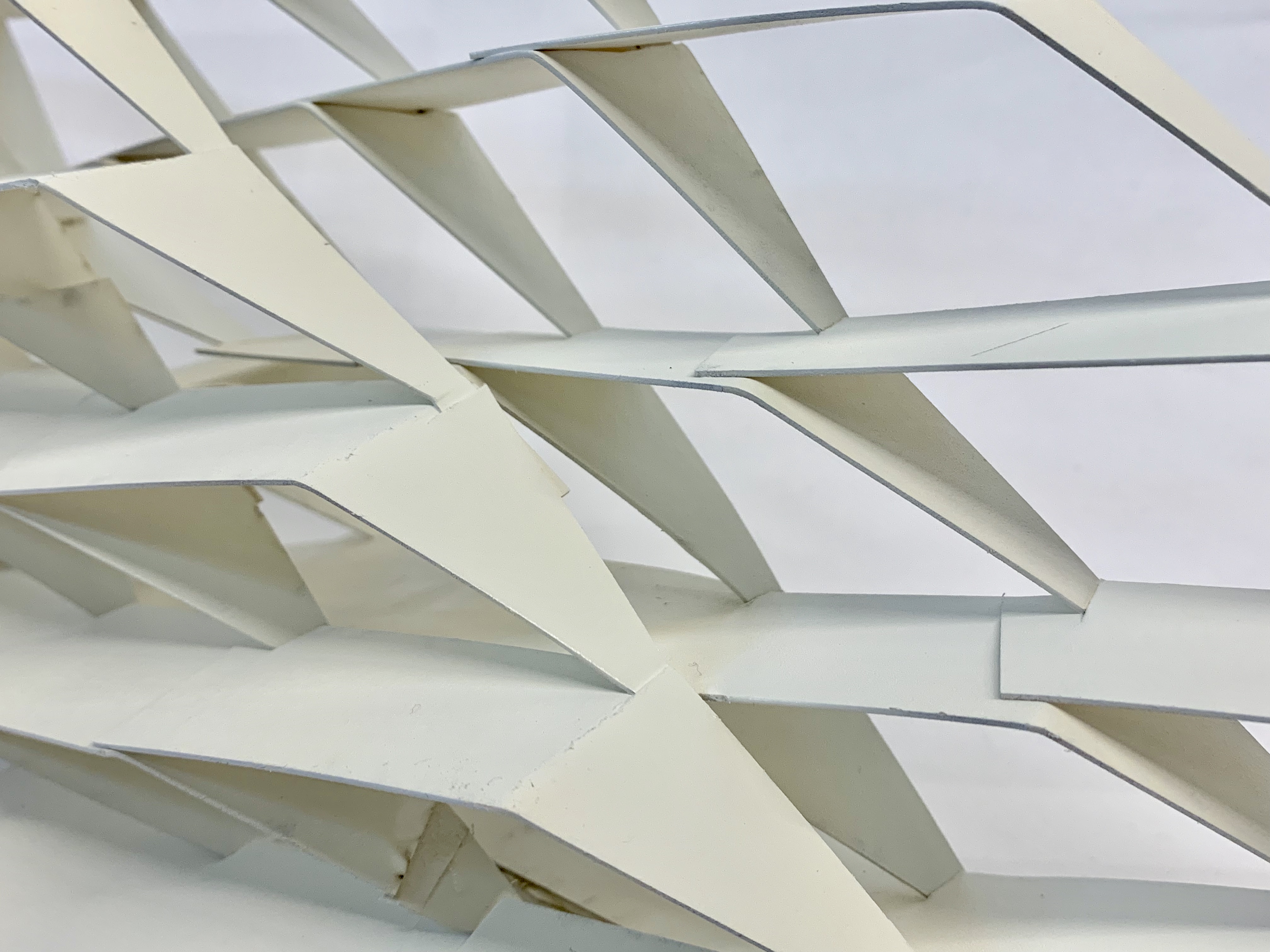
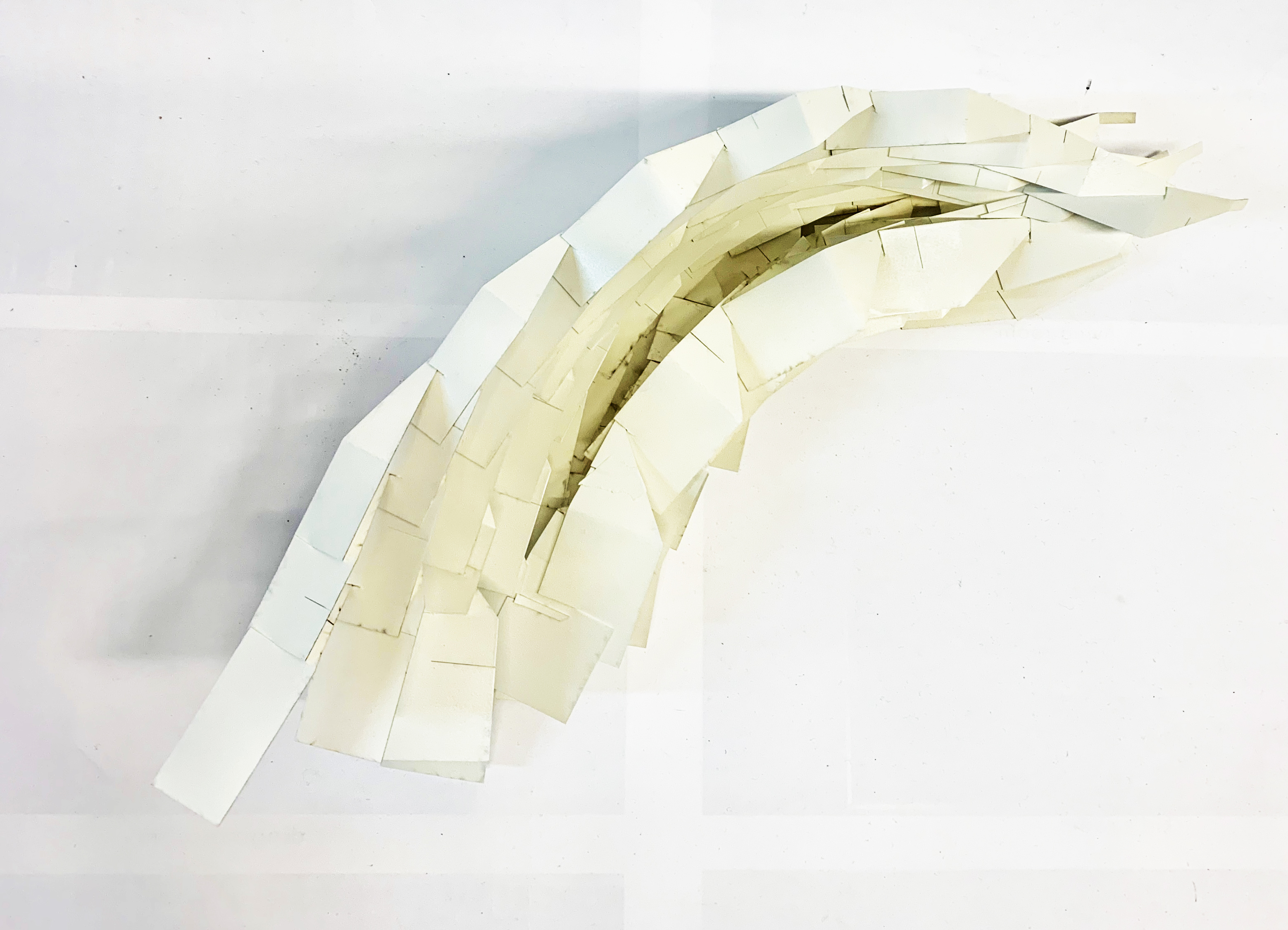
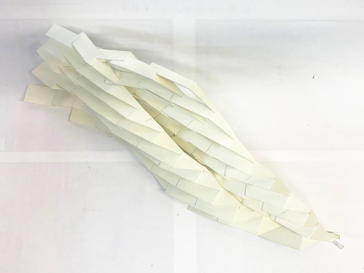
My idea is to design a multi-function container. Usually, it can be used as a vase of dry flowers, sometimes it can be opened to contain more small things inside. The inspiration comes from the pattern of walnut and leaves, which inspires me to design a container with organic shape and idea.
Revised version
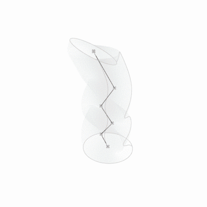
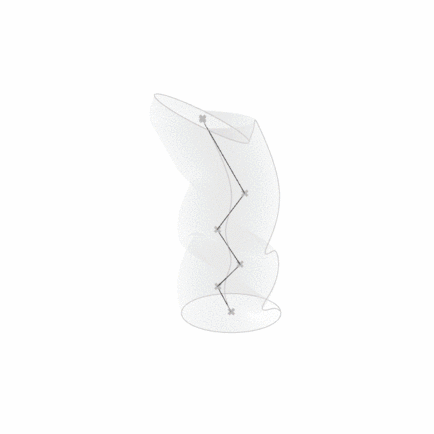
The curves are designed for a container which can be opened in the middle.
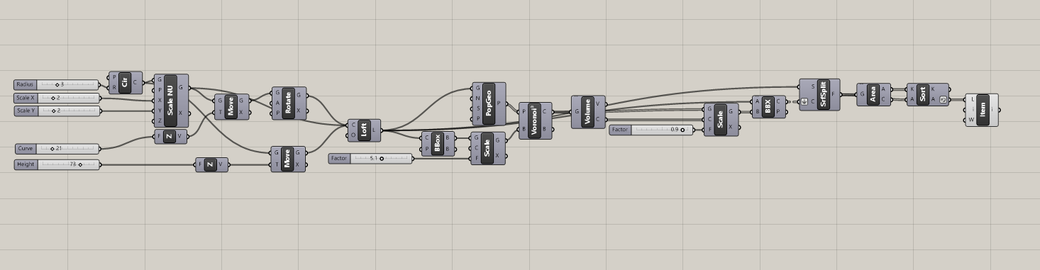
For a better interpretation of the model, I reset the part of setting in my grasshopper. I don’t change the demand of my grasshopper too much but focus on adjusting the value of fly.
The items below are the test I made.
Example : Fly via the value of m+ Diamond and distance
Example : Fly via the value of Mesh UV and distance
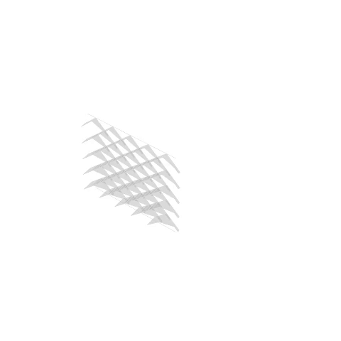
Part of Final version : (See the whole thing in thread)
This design was mainly inspired by the organic formation of bubbles as they layer on top of each other. The intention was to create a web-like light that would be able to cast interesting shadows on the surfaces of objects below, in order to add removable pattern textures to any surrounding objects. This allows non-permanent patterns to be created as well as allows for there to be changes in the space depending on ethereal qualities. The changes throughout the day will allow this light to incorporate the aspect of time as well into the design. I wanted the shape of the object to be more randomized rather than organized, just like how foam would naturally form without any particular shape and order. Therefore, there is no particular structured look to the project and the light needs to be hung because there is no set base. It really depends on which component numbers you decide to mix together in order to determine whether or not it will be able to stand.
To achieve this effect I mainly set up a Voronoi shape within a specified cube and then created a curve within that cube set with various points. In order to have these solids adhere to the curve I then mainly used weaverbird to create thickness on the edges so that there is a frame surrounding the individual pieces. The density of these frames can be changed to encompass just outline of the shape or to generate more complex lattices within the borders of the shape. Most of the problems I experienced at this stage came from setting up thickness and from trying to create more variation in the definition to produce diversity.
In the process of printing, I realized that because there is such a complicated lattice system incorporated it was very difficult to adhere to thickness requirements. I ended up having to add a new command to adjust and control the thickness even more for it to work. This alone took multiple tries and tests of running back and forth between the 3d printing lab and the computer labs. Even then, in order to print it, the model had to run through magics many times in order to get all the corrections and the printed version required a lot of cleaning up and aftercare work in order to take photographs after. Therefore, I feel that 3d printing technology is still rather limited in what designs it is able to produce off the computer and unfortunately with our current technology a lot of grasshopper definitions cannot yet be realized in real life. Fortunately, with adjusting most of my family members were able to work. It just took some compromises especially in size, thickness and density in order to create a workable shape.
In the last review, I received some critiques about having more specific commands and specific points instead of randomized so I created a variation of the Voronoi command with more movable points.
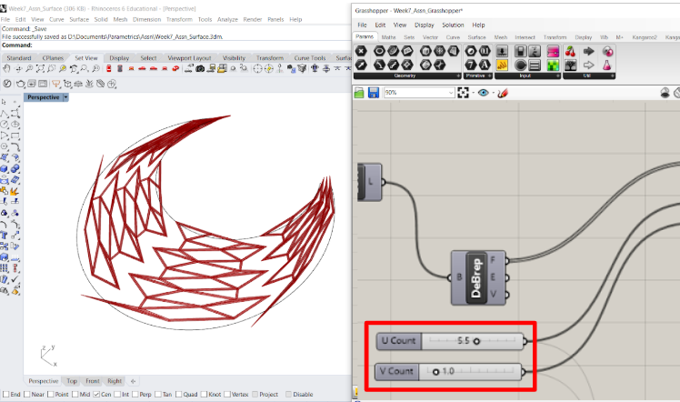
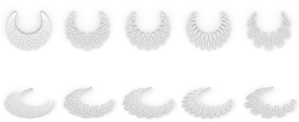
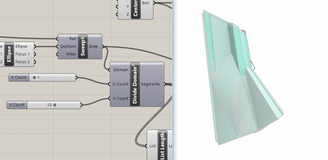
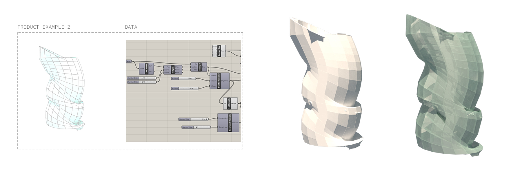
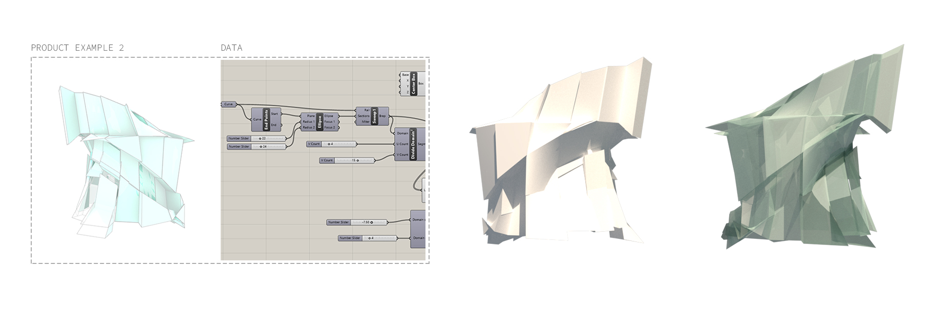
The design of this product family is aimed toward planters. I was inspired by images of existing planters with more of a geometric shape and pattern. I saw potential in using the simplistic geometric shapes to modify and create a new type of pattern. As I was developing my design, I decided to use the same base for all my final planters. This meant that they all have the same size and shape, however, the pattern it produces would be different. To achive this, I used a diamond tiling that enabled me to make a pattern that resulted in holding a bigger shape and held together by a small shape. Depending on the U or V count for the diamond, I was able to generate a variety of patterns that are very different. Because I wanted to make the design a little more exciting, I designed a ‘gradient’ effect, where as the diamond shapes get smaller toward to the bottom; it appears to make the top eventually blend itself to the bottom and creates a blurring between the big and the small.
In the process of 3D printing, I found out that my inital five final products is too thin and it would be too fragile to print. Later, I modified the design a bit further and played around with the thickness of the material more. This made the final 3D printed version of the planters. However, I really wanted to have the printed planters with more of the thinner thickness because I believe that the geometry of the pattern is able to be expressed more in the thinner iterations.
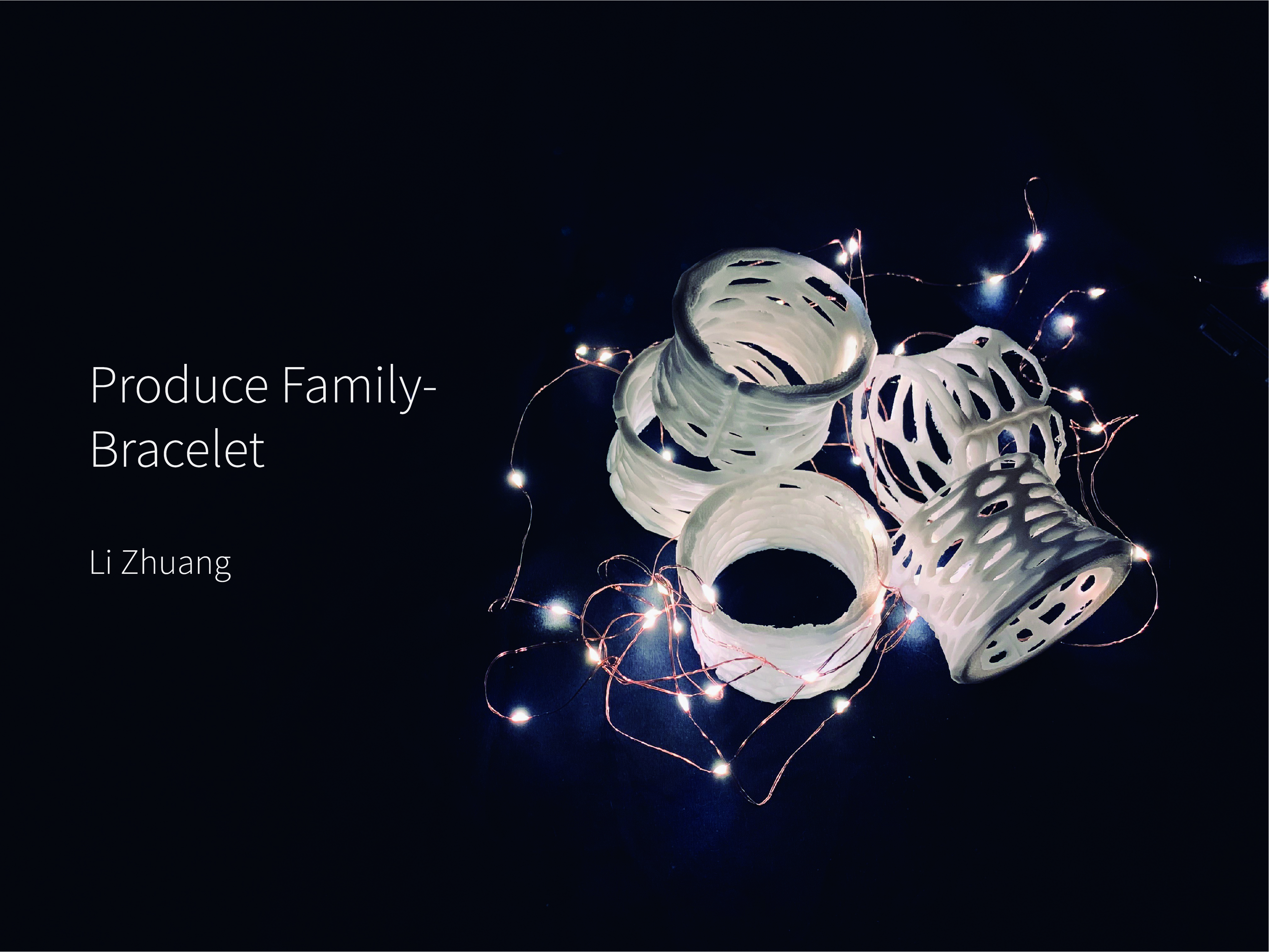
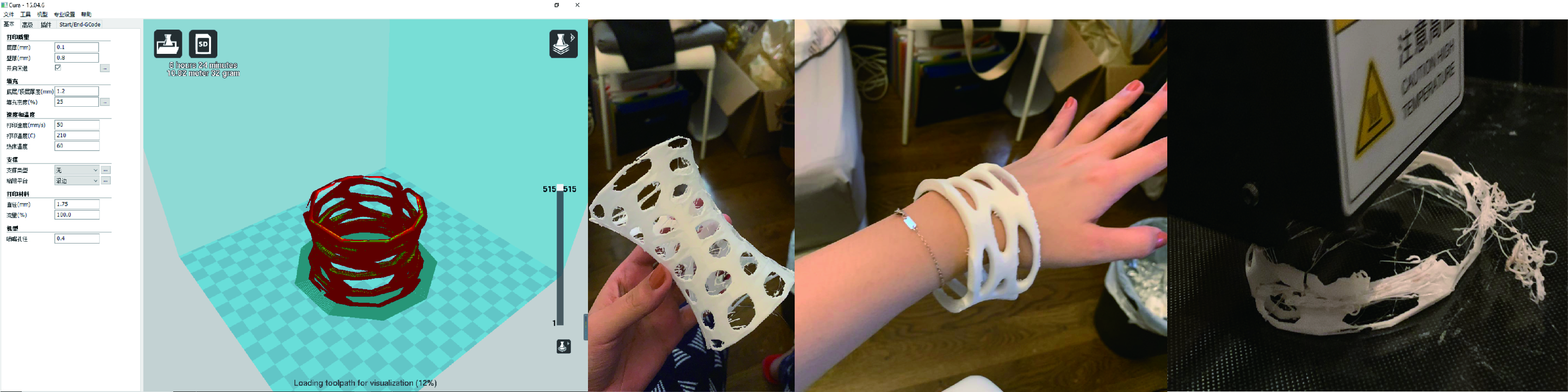
Before the bracelet design, what I did was the design of the phone cover. Later, because the phone cover requires higher printing details and the accuracy of my home 3D printer is lower, the direction was changed to design the bracelet. Both designs use the same design elements: a random cutout pattern, VORONOI in the grasshopper.
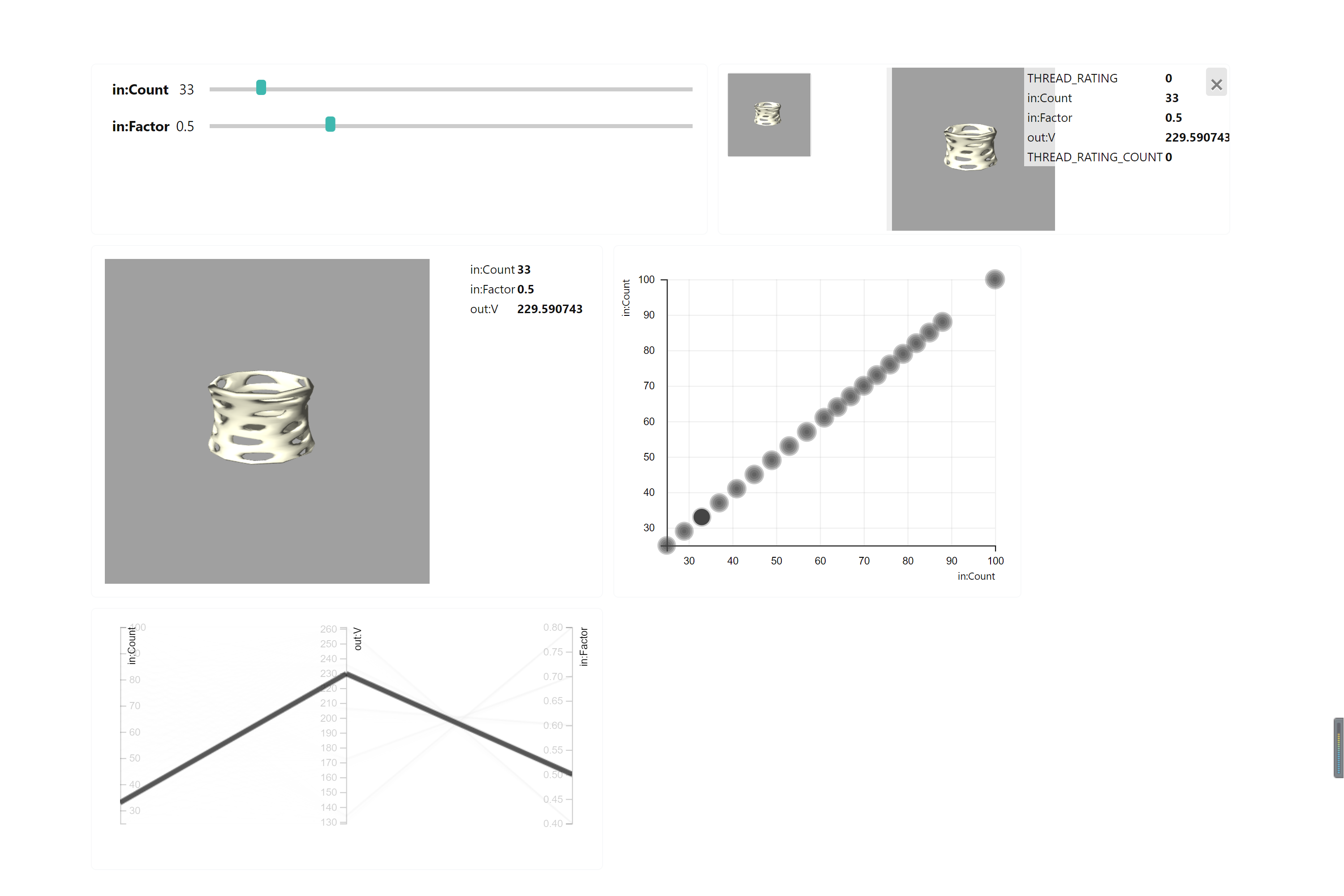
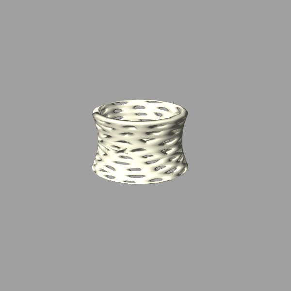
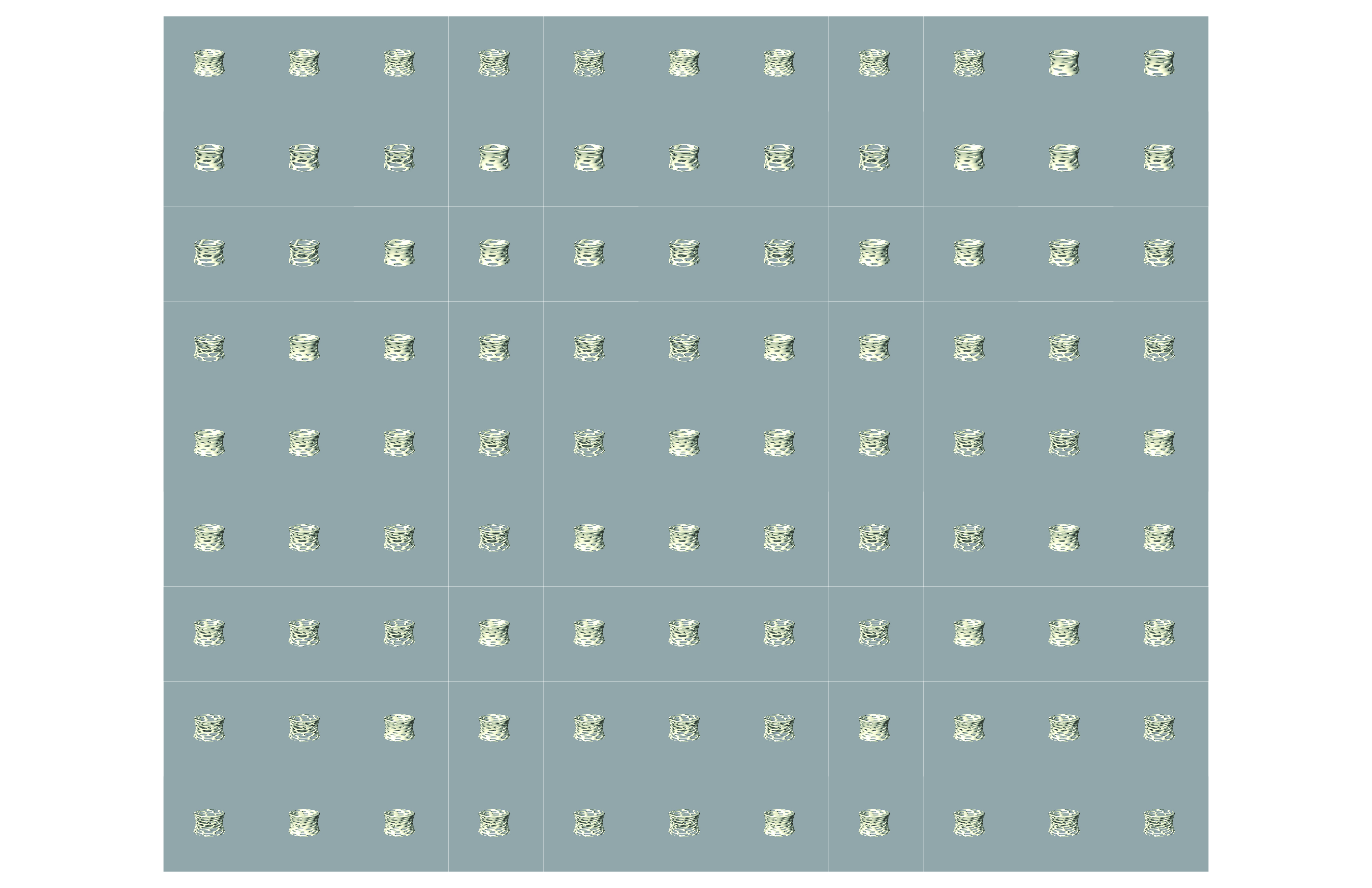
The design is inspired by the pattern of cells and their randomness. According to research, the current urban population has a need for touch, so the design of hollows can enhance the tactile experience of the product and satisfied people. In the process of grasshopper design, I first measured the size of my wrist and hand, to ensure that the finished product can be suitable for my hands, and use this data as the basis of the surface morph. The shape of the bracelet is small in the middle and small at both ends, which is a combination of Rococo and modern minimalist style. By varying the size and number of holes, different patterns and varying degrees of feel can be produced.
In the process of 3D printing, I faced some problems. The first is the thickness of the model. I ignored this at the beginning of the design. When the first model was printed, there was too much support PLA material in the hollows due to the thin thickness. Secondly, because there are a lot of hollows in the model, it is easy to appear the dangling of the 3d printed material, which leads to model broke. After that I revised the thickness of the model and appropriately reduced the distance between holes.
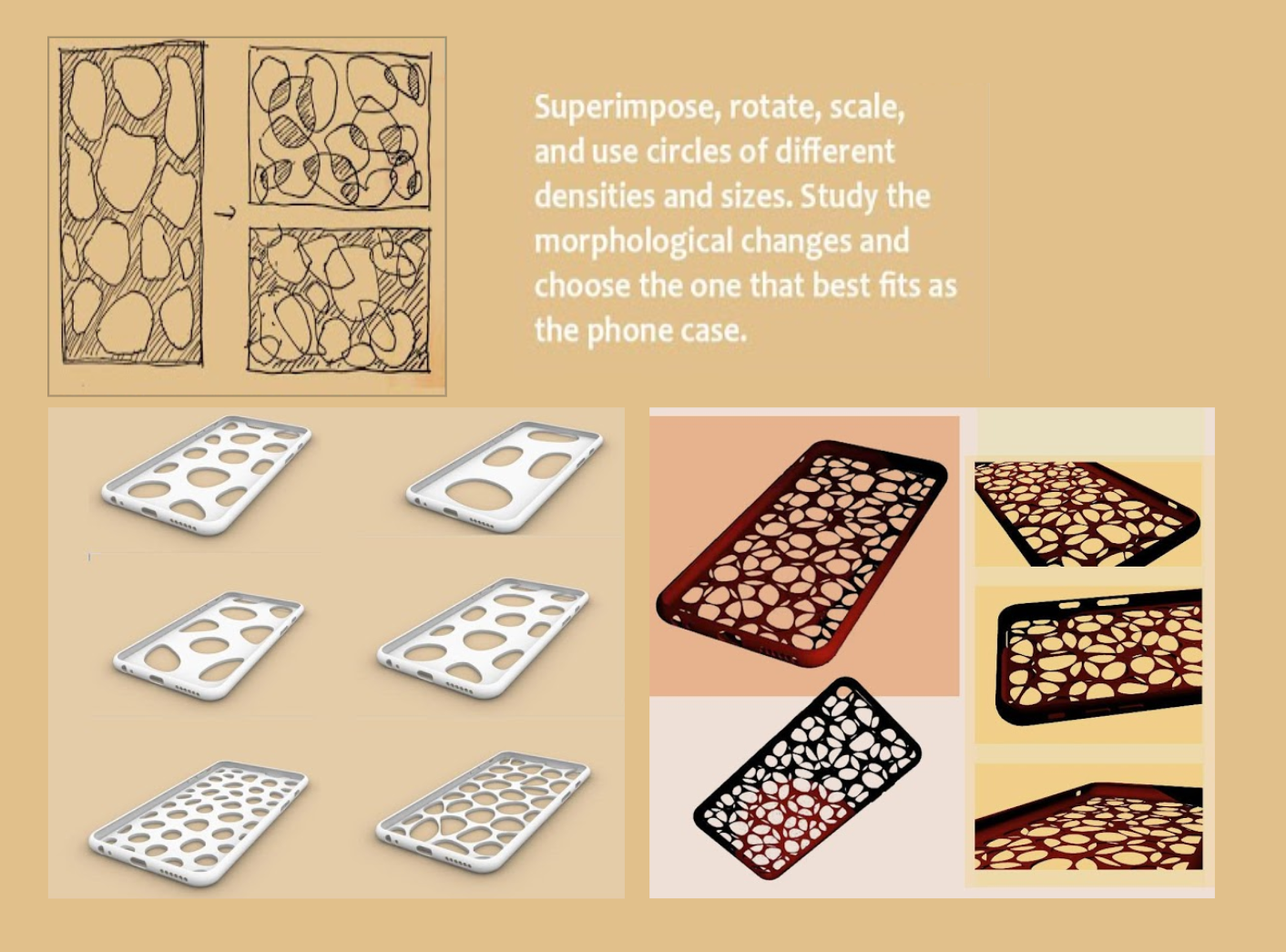
Previous Phone Cover Design
In this project, I learned how to use tt toolbox to take screenshots and use thread for visual data analysis, and understand the basic functions of grasshopper. However, there are still many problems that I cannot solve because I lack the ability of control details. In the later study, I will first think deeply about the design details and then use software to archive them.
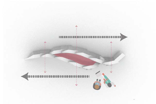
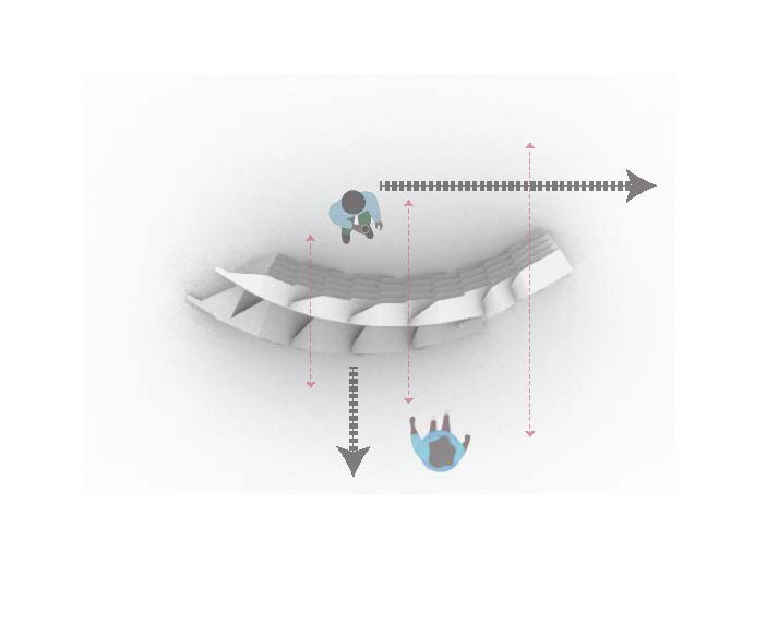
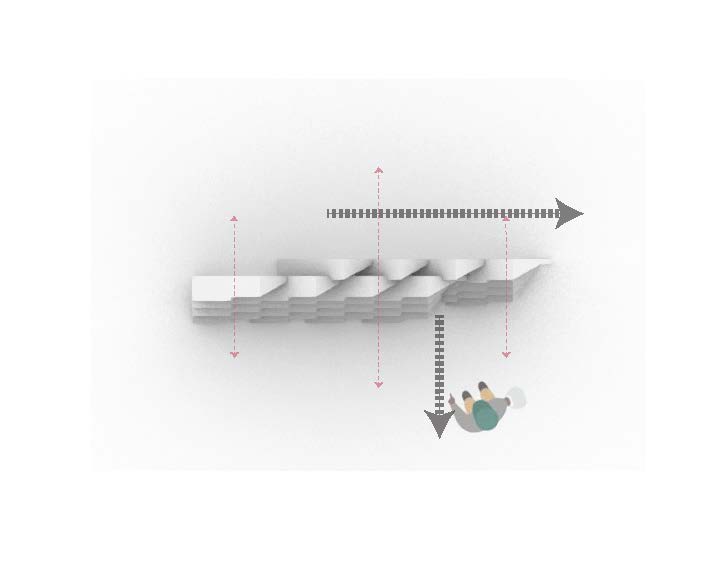
The screens are intended to have a certain interaction with users, the different kinds of interactions can be altered and controlled by the alternating the level of the overlapping layers.
The control of the moving Y and X Axises.
The difficulty that I faced was the way to notch three pieces of planes together, the problem with which plane goes on top of which plane will make a better joint instead of creating more tear.
At the point where I solved the notching system, the issue of the weight of the paper comes at the end of the project. In the digital renderings, the folding planes stay at a 90-degree angle. However, in the constructing stage of the project, I realized that it is extremely to hold the plane at a perfect angle. And if one base layer is not at the right angle, the layer above will be at the wrong opening angle as well. Yes, it was a real challenge.
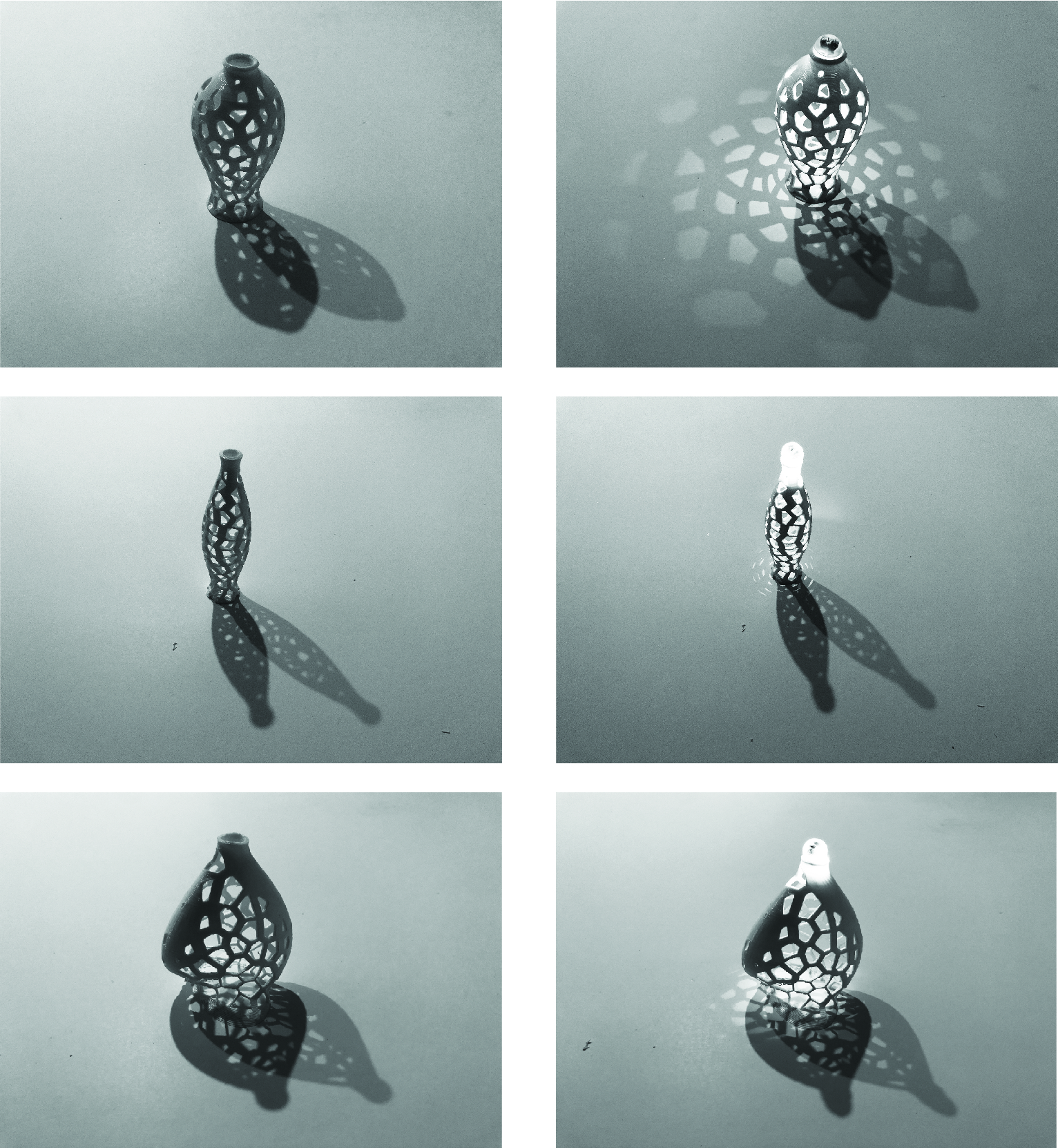
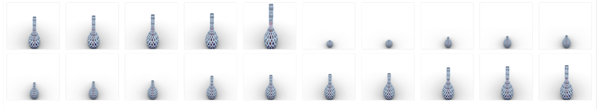
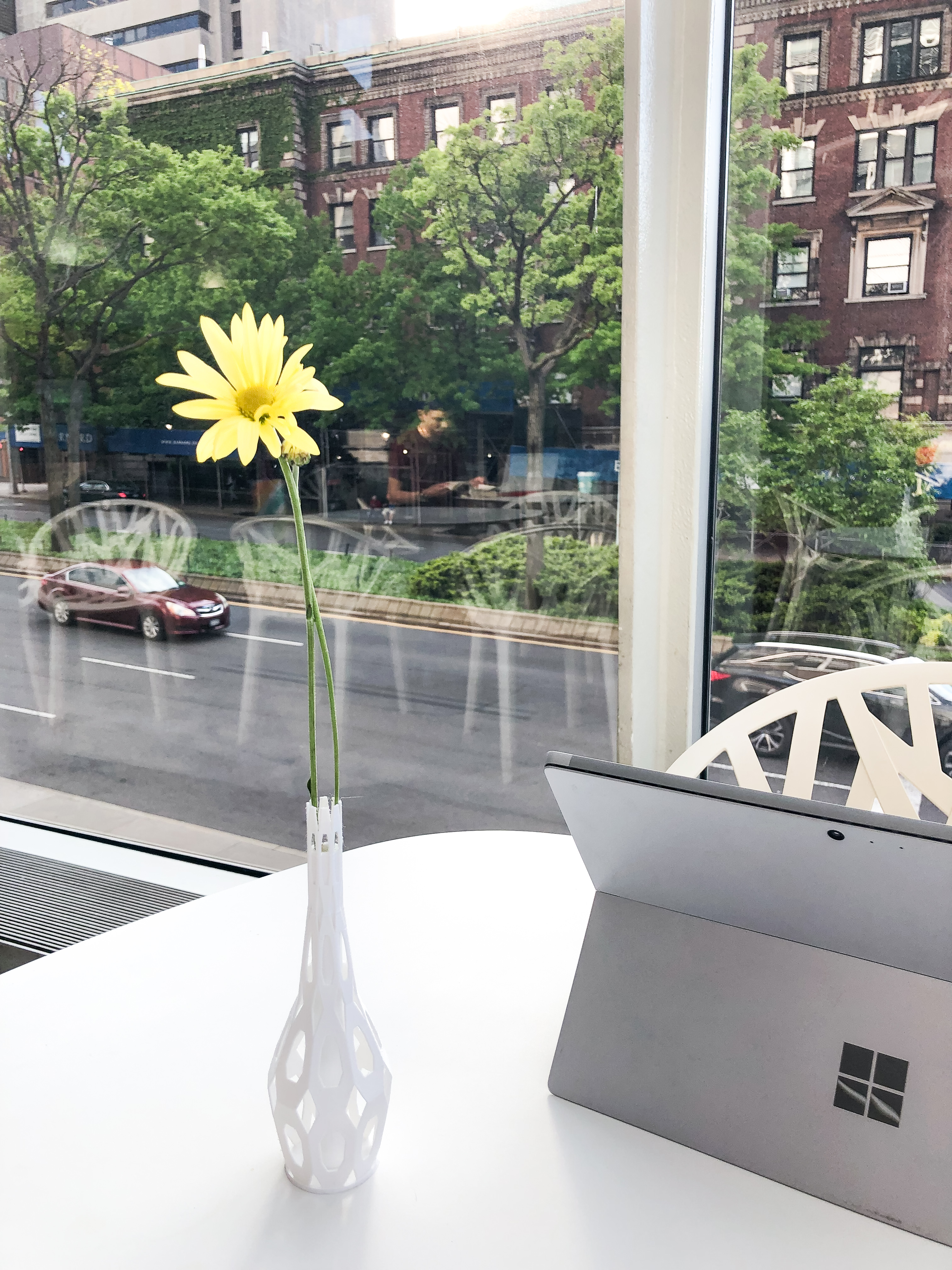
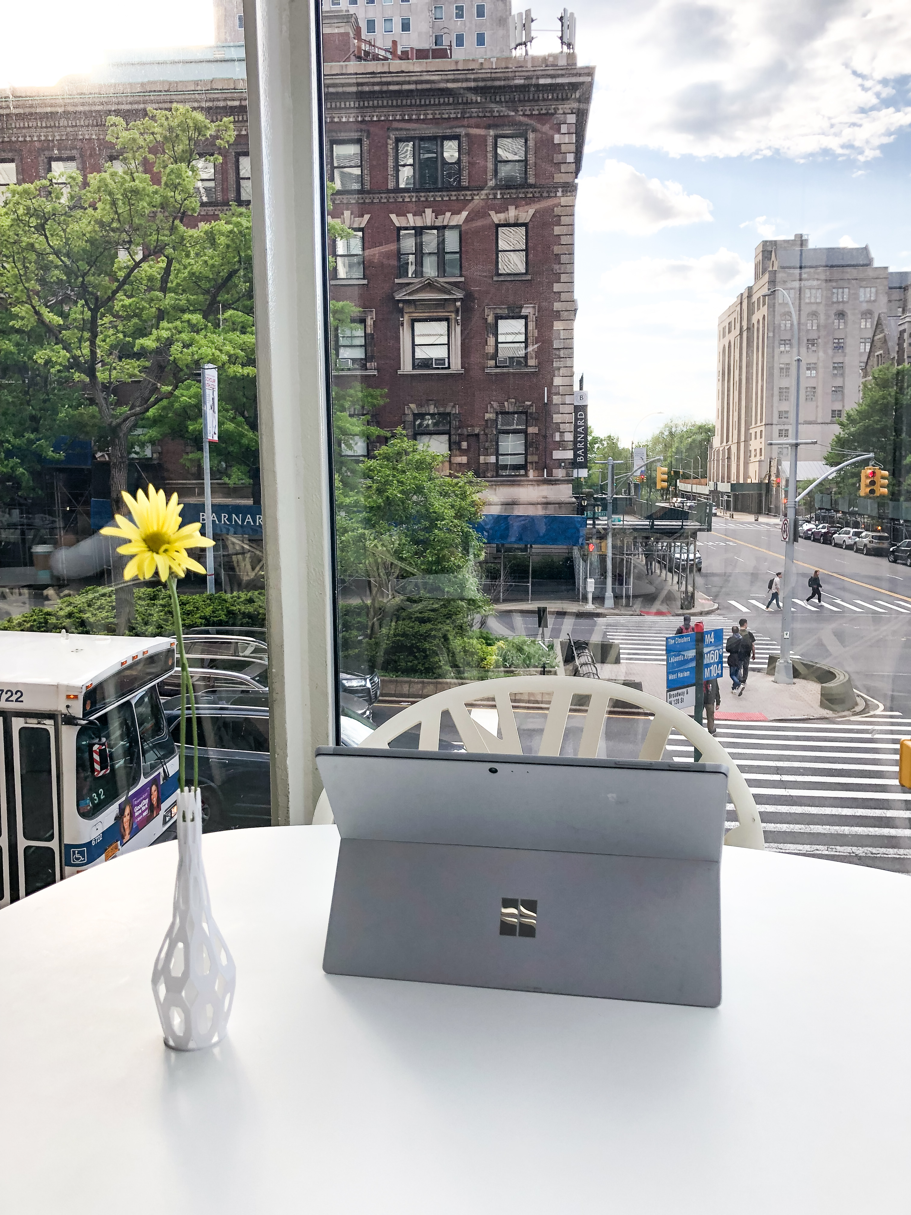
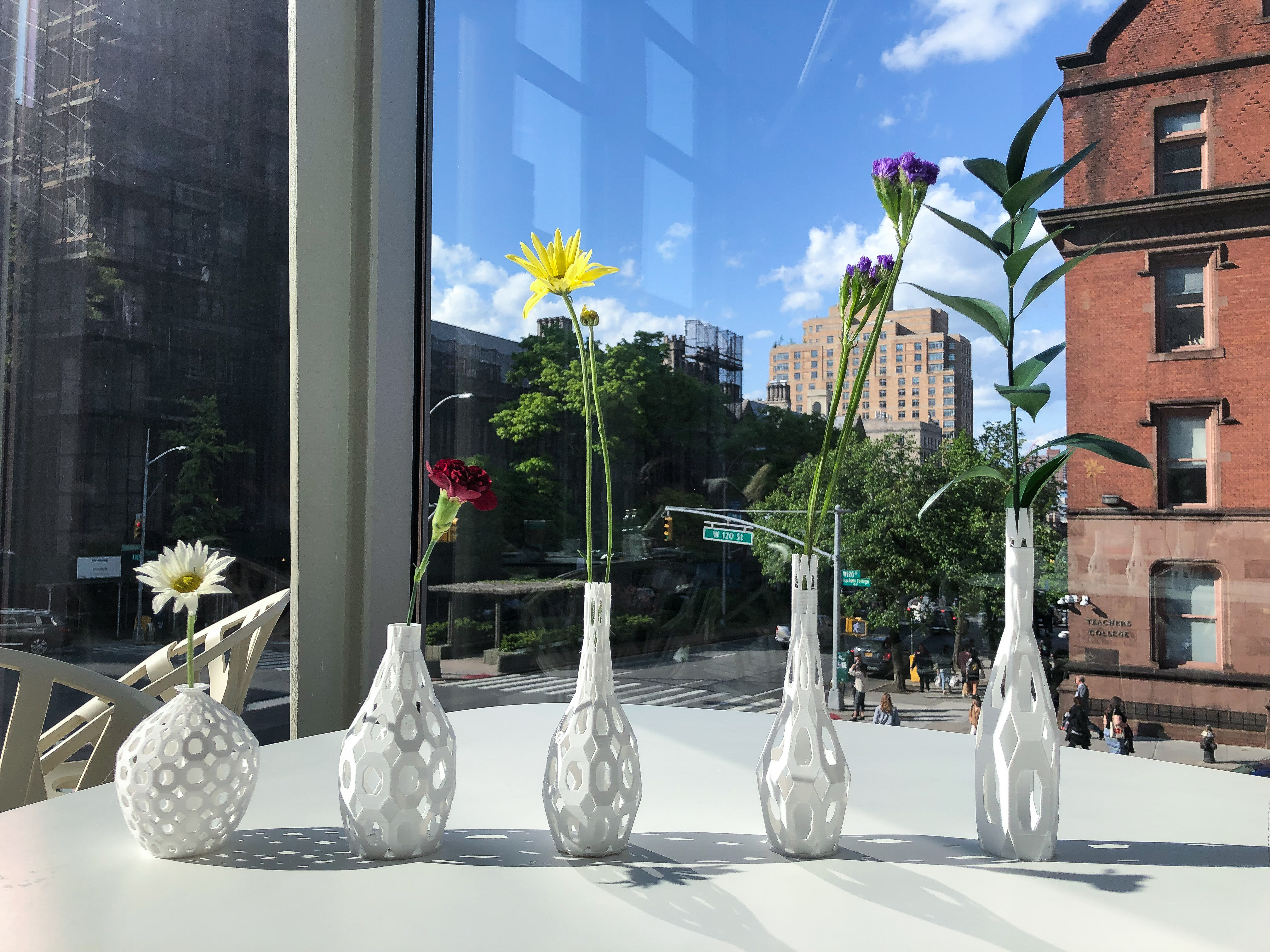
This series of vases is for single flowers. So the bottle mouth is relatively narrow. At the beginning, the part used to fill the water did not touch the ground. It is attached to the top of the vase. But if you do that, 3d printing will not be possible unless I add support when printing and then take it away. On the other hand, if the water-filled part is attached to the top, the hollow at the top of the vase will be filled. This will lose the effect of hollowing out. So in the end I decided to move the water-filled part down and let it stick to the ground.
I printed them myself, so I can move the settings throughout the printing process. At the beginning, the middle part I didn’t connect well to the bottom. Because it is not standing firmly, it moves back and forth during the printing process. So the first time I printed, the middle part was not successful, I had to stop printing and then modify the design.
Therefore, in order to make them more stable, I added a bottom to the vase.
Overall, I really like the result. And the project was very interesting to do, although it was a bit hard for me to pick up the skill in the beginning.
The initial idea for designing the lantern is to use the gap in between the strings to create an ambient environment. When I went further in the design process, I figured out that not only the light can passes through the form of the lamp, but also can pass through the material that the lamps are made out of. The density of the strings, the levels of the twisting, the repetition of every level, the tight and release of the top surface all tells the stories of how light is creating an atmosphere for the users.
I decided that the light is shining upwards to the twisted lamps to emphasis and to charm with the upward growth of the string. In the final stage, testing with warm lighting with the lamps, the atmosphere becomes soft and almost diluted; space seems to starts to become a linear element to twist, to grow.
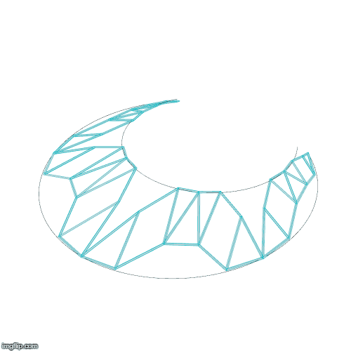
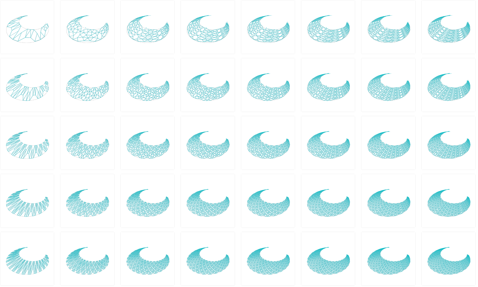
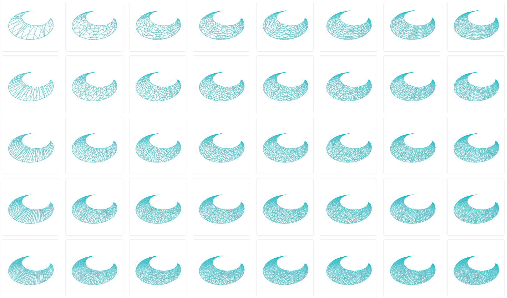
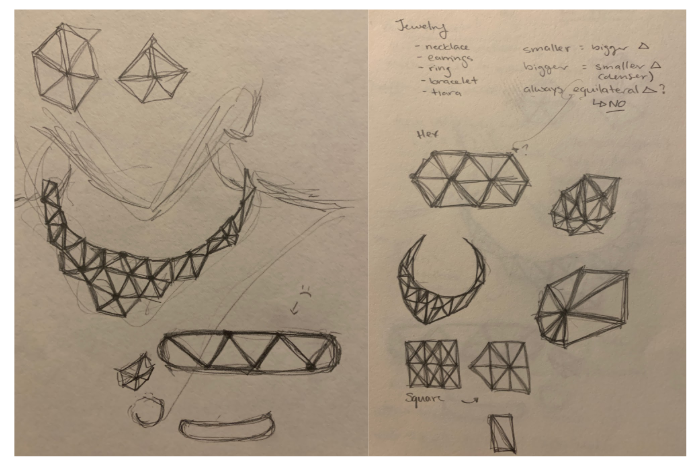
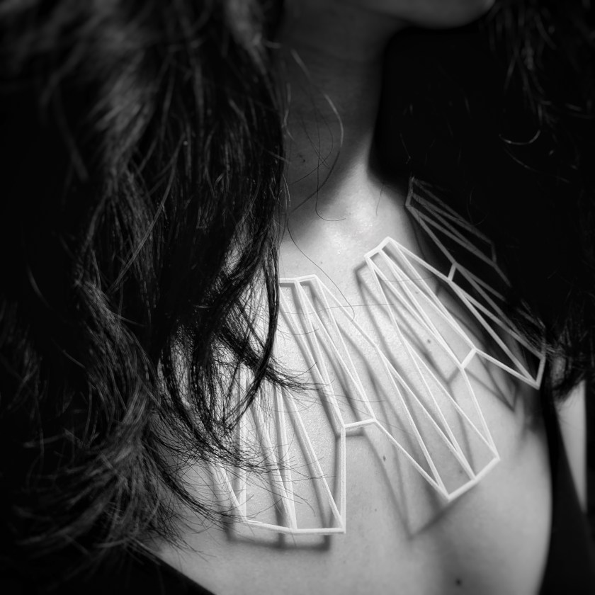
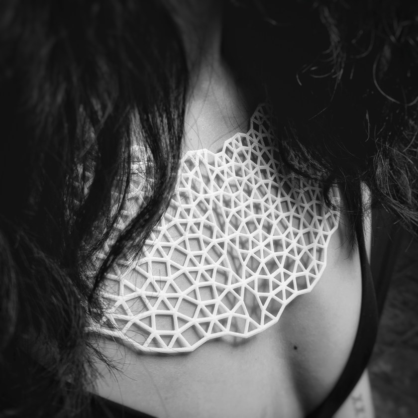
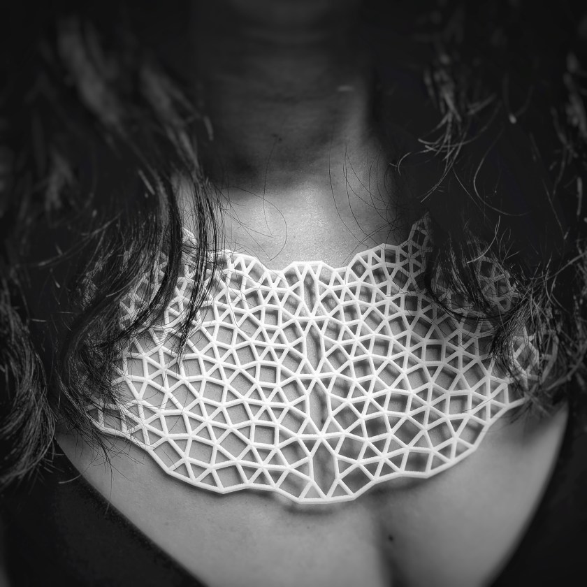
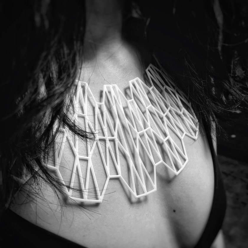
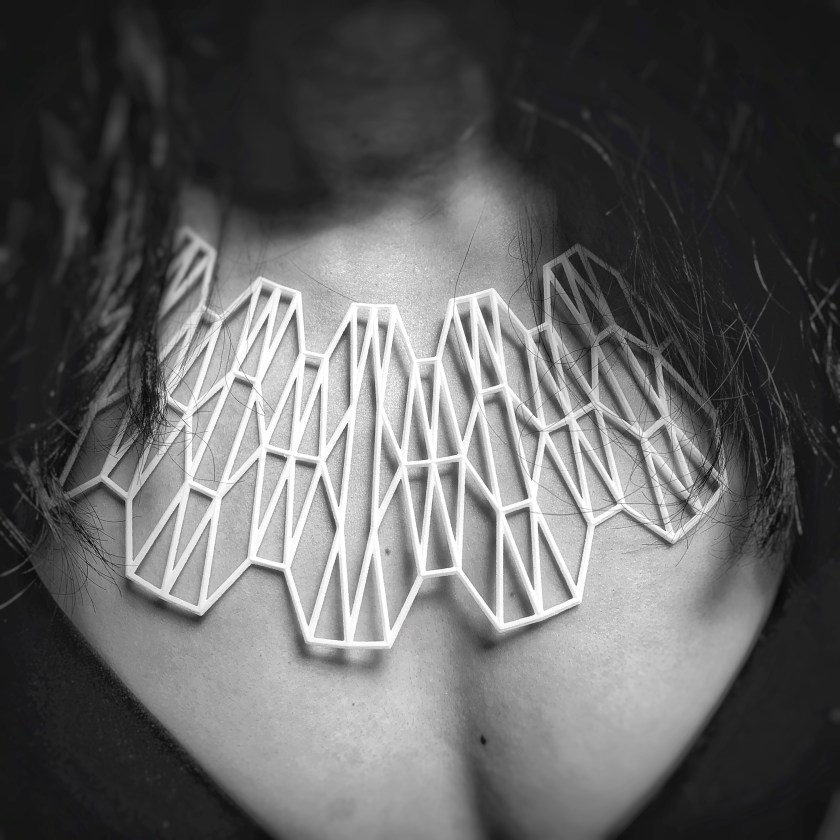
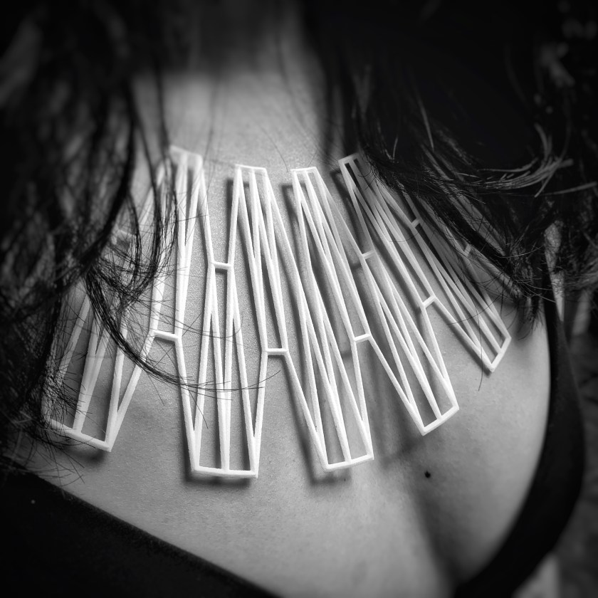
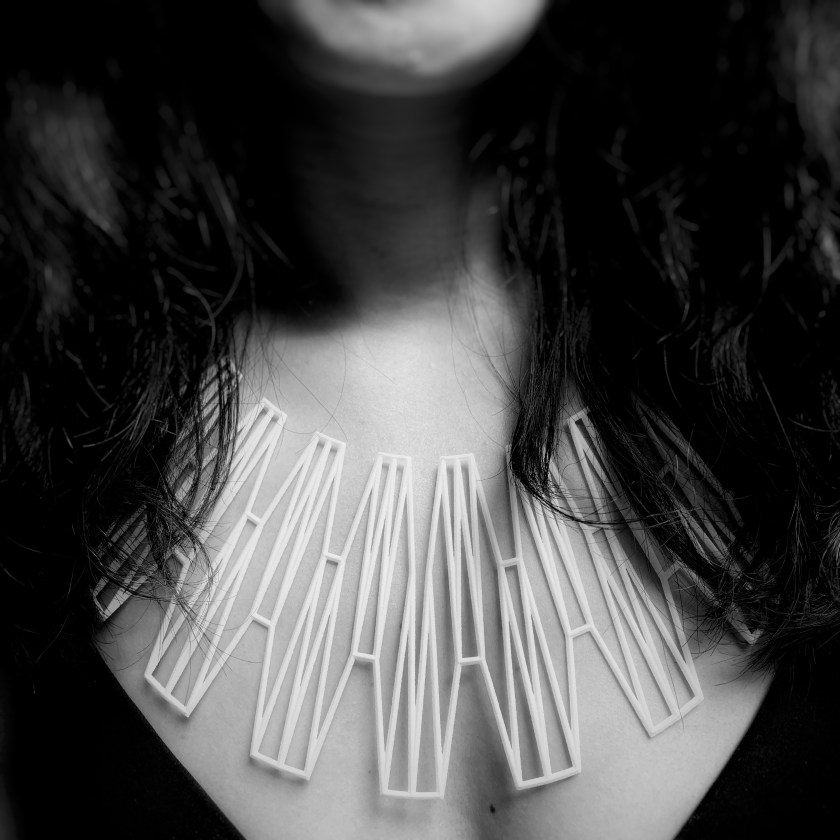
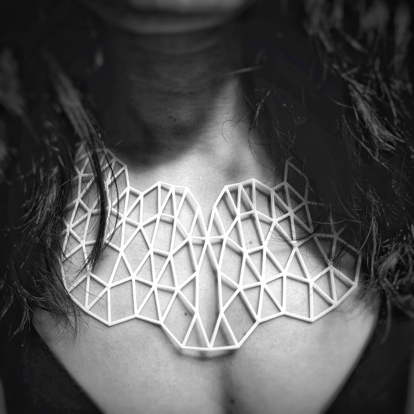
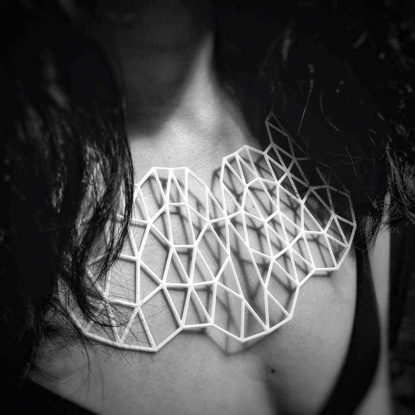
My product family is a series of necklaces. My initial idea was to work with triangles to create patterns of different density to form necklaces with varying opacity/transparency.
During the midterm presentation, I mentioned the issue where at certain combination of the horizontal and vertical change, the necklace would break into 4 separate pieces, unconnected. After the midterm, the horizontal condition was adjusted to have only even number and this resolved the breaks in the design. Another condition (edge condition), was added into the overall design to help form an edge. With the formation of the edge, it finishes the ends of the necklaces so that they look a little more polished.
The final 5 were selected because they showed the evolution of the pattern design in transparency/opacity the best. I felt these 5 examples best exemplifies my idea and helps to strengthen the product family of necklaces as a series.
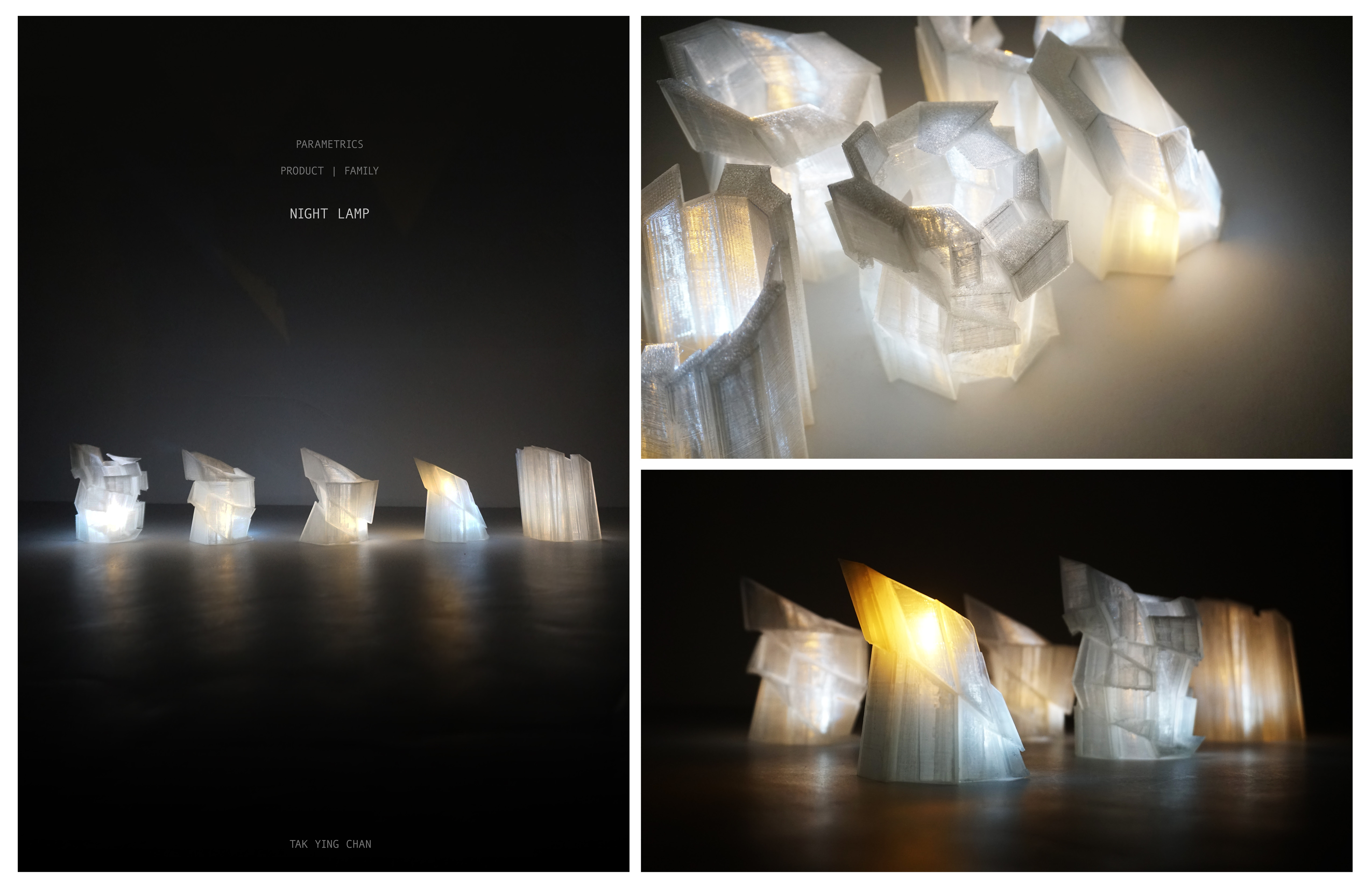
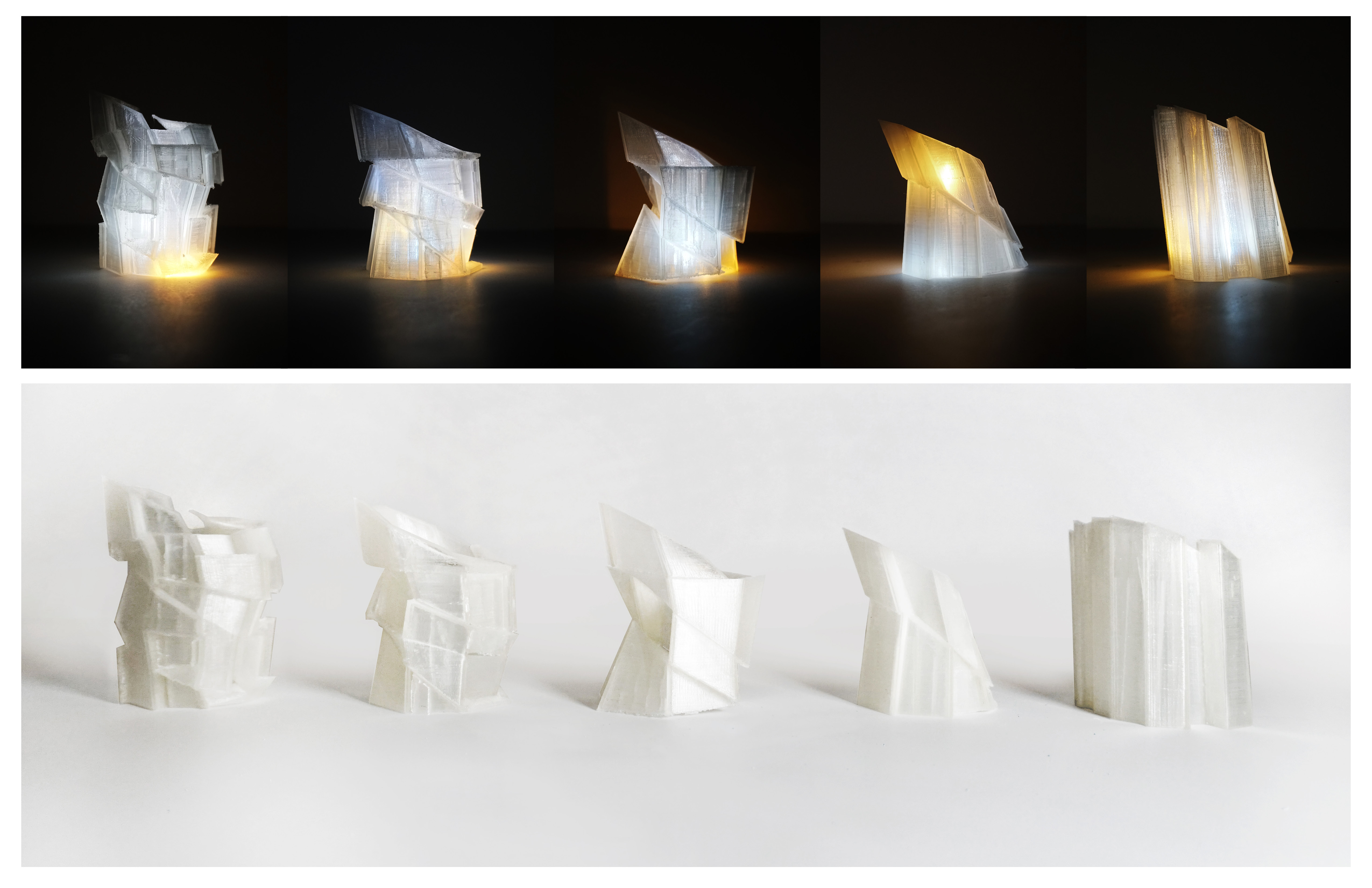
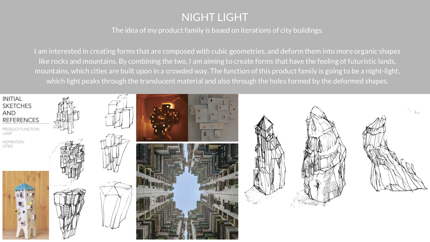
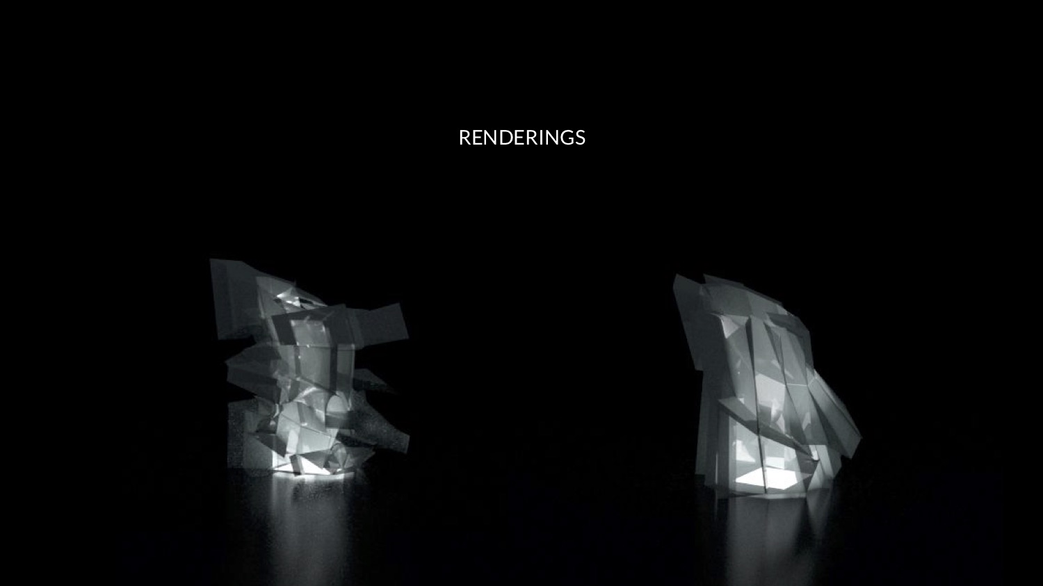
The idea of my product family is based on iterations of city buildings into imaginary shapes of organic designs. I am interested in creating forms that are composed with cubic geometries, and deform them into more organic shapes like rocks and mountains. By combining the two, I am aiming to create forms that have the feeling of futuristic lands, mountains, which cities are built upon in a crowded way. The function of this product family is going to be a night-light, which light peaks through the translucent material and also through the different layers formed by the deformed geometries, creating different lighting opacity through the edges of the faces.
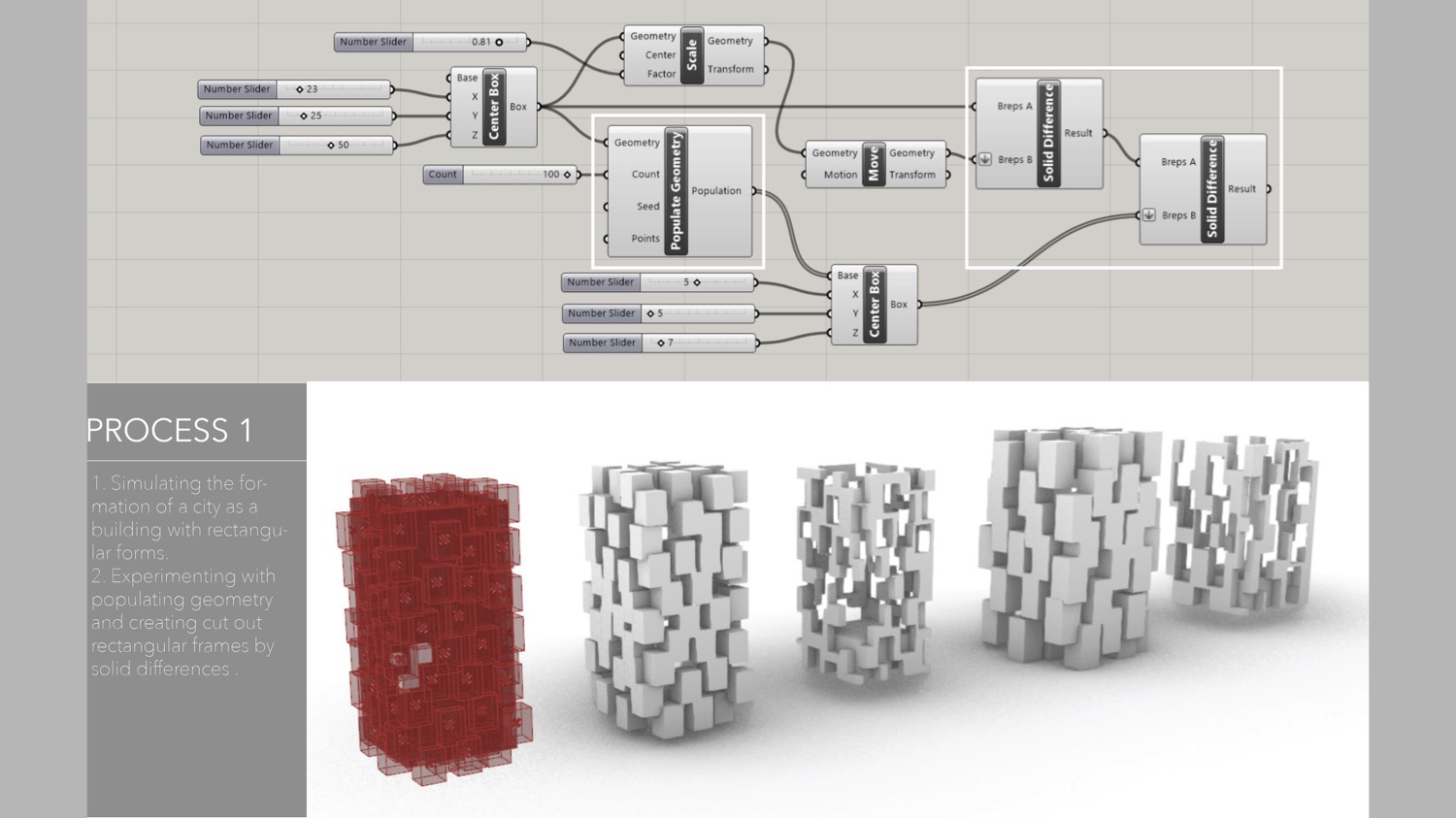
During the process, the major challenge that I encountered was how to make a populated geometry to be able to transform into different forms of compositions. It was difficult at first when I first tried to write the definition with the populated geometry tool to create the effect, since it was a lot of solid geometry, the definition ran very slowly and was unable to transform in a different overall shape.
After using the surface box tool, geometries were created along the surface guided by a vertical line instead of creating multiple individual solids. This allows the composition to change easier as one body instead of controlling every individual components. Using that element, I was able to create different combinations of transformed boxes and treating them in a more organic way.
I selected semi-clear plastic as my material to 3-d print for its effectiveness of translating light in a soft and gentle way. I also used two different colors of light source in order to make the effect of the changing surfaces of the geometric transformation, which the change of wall thickness and angles of faces change the way light translate through the body of the products.
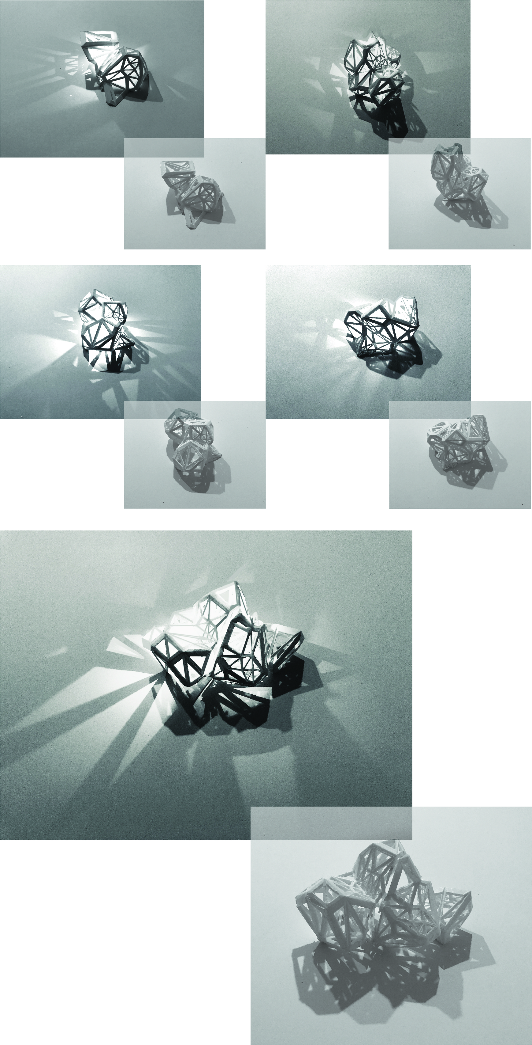
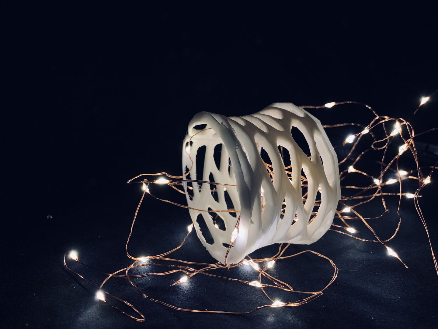
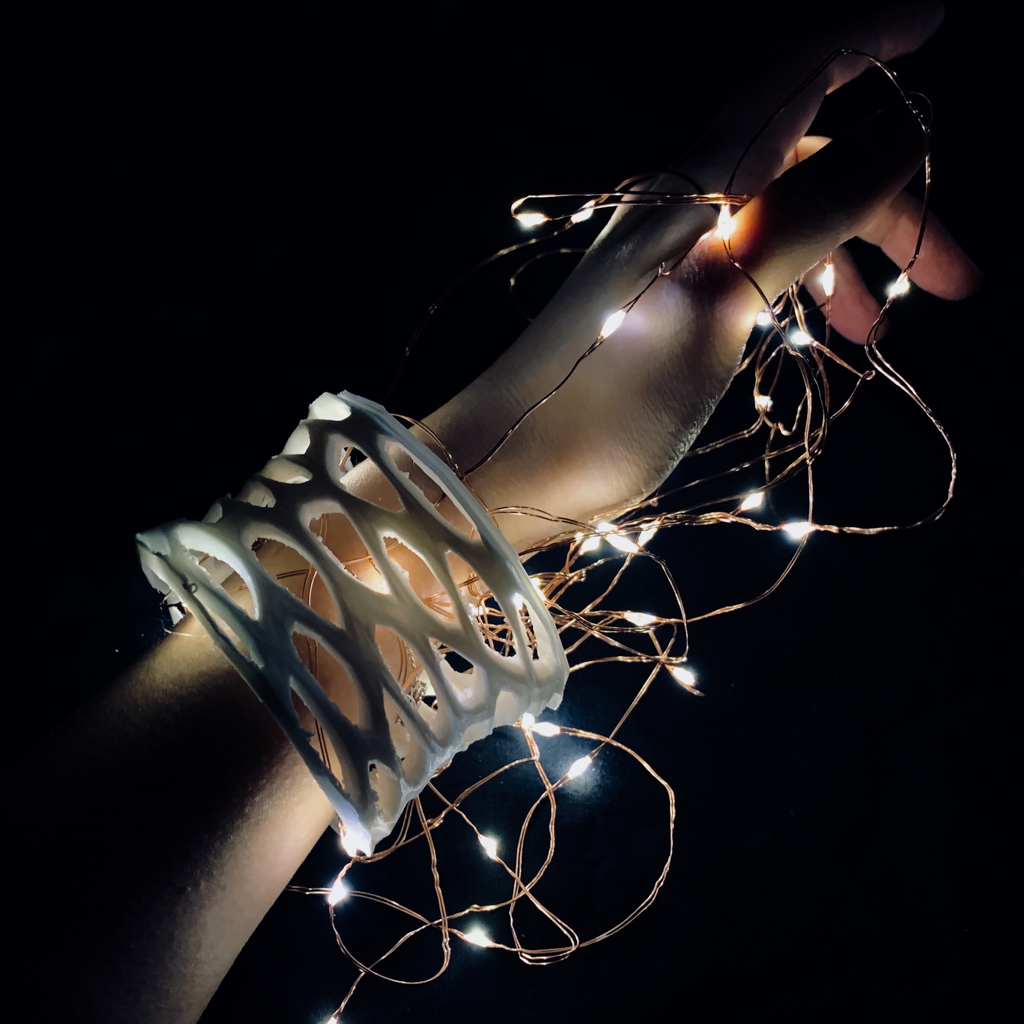
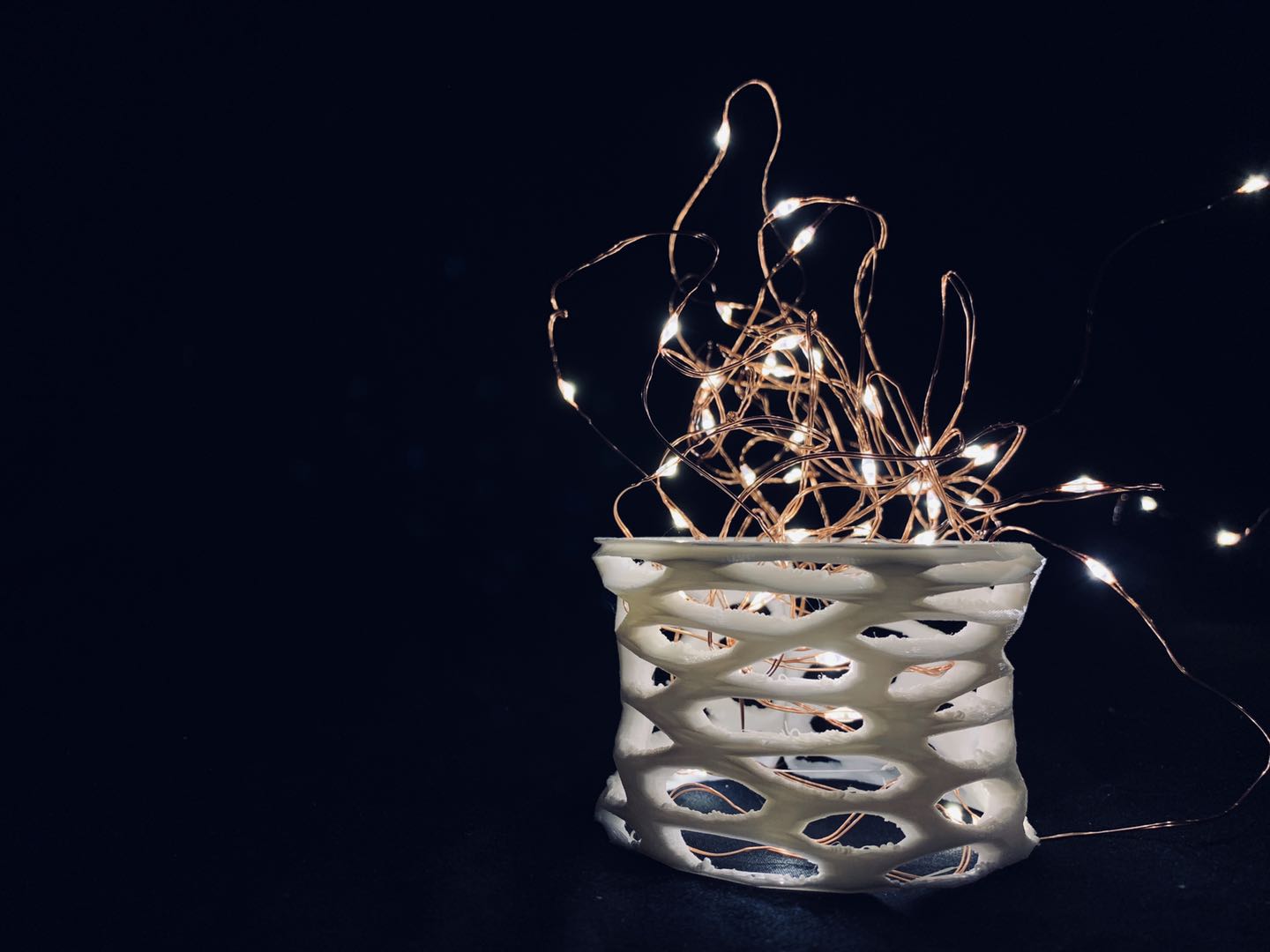
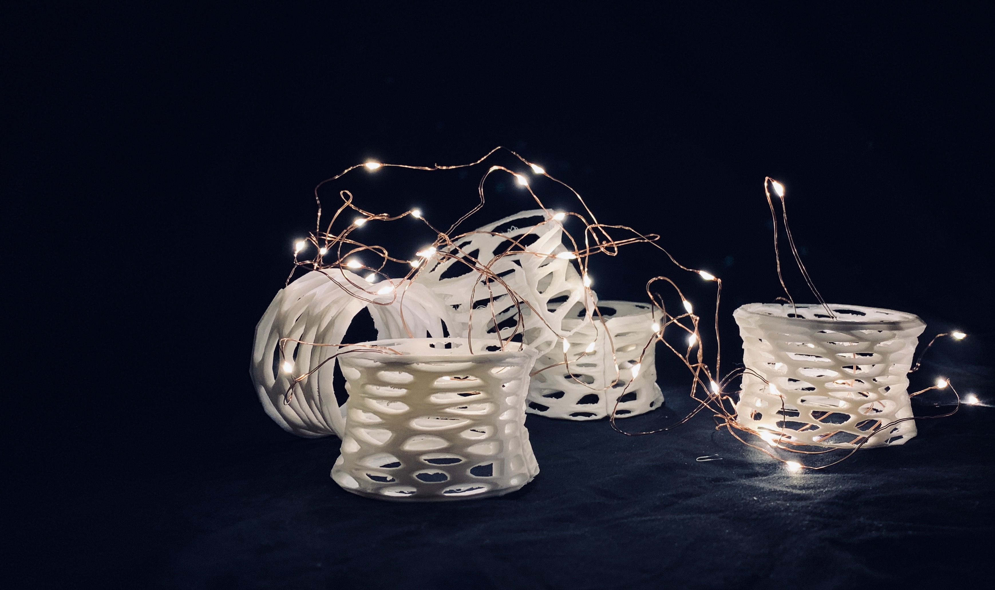
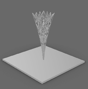
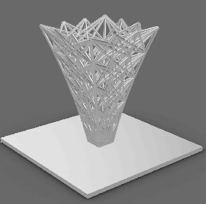
This project was initially inspired from iron tower which has a intricate appearance and strong wire construction. My intention was to create vessels with multiple functions. In order to do that, I made the project super flexible in regards to the size of the object, points of division, size of openings, density and thickness of lines. As you adjust the variant, the vessel becomes vase, basket, or pen container.
The basic process was to build rectangle frame at first, and then having lines connect among points on all vertical frame lines. It didn’t work when I first tried to build line across the rectangle frame at once. In order to solve the problem, I tried to do four sides individually so it combines branch cross links and points with lines. By adding sliders and curves, it can adjust the size of openings and control the effect of expansion and contraction of the model.
The challenge that I encountered during 3d print was hard to figure out. Firstly, I have to transform everything from surface to mesh in order to print. Because there are too many lines in between the frame structure, I have to adjust the thickness of lines so that it would be able to print. Eventually, I got the physical model printed successfully. Even though it does not look as elegant as the digital one in terms of the material that used for 3d print.


 Example : Fly via the value of m+ Diamond and distance


 The control of the moving Y and X Axises.


")

 More thoughts behind the product family….


You must be logged in to post a comment.